Skip to content
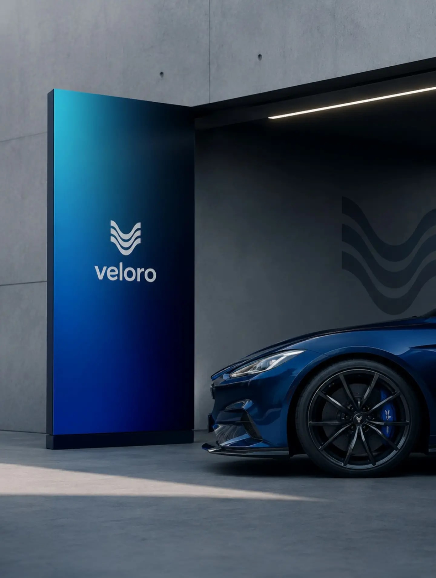
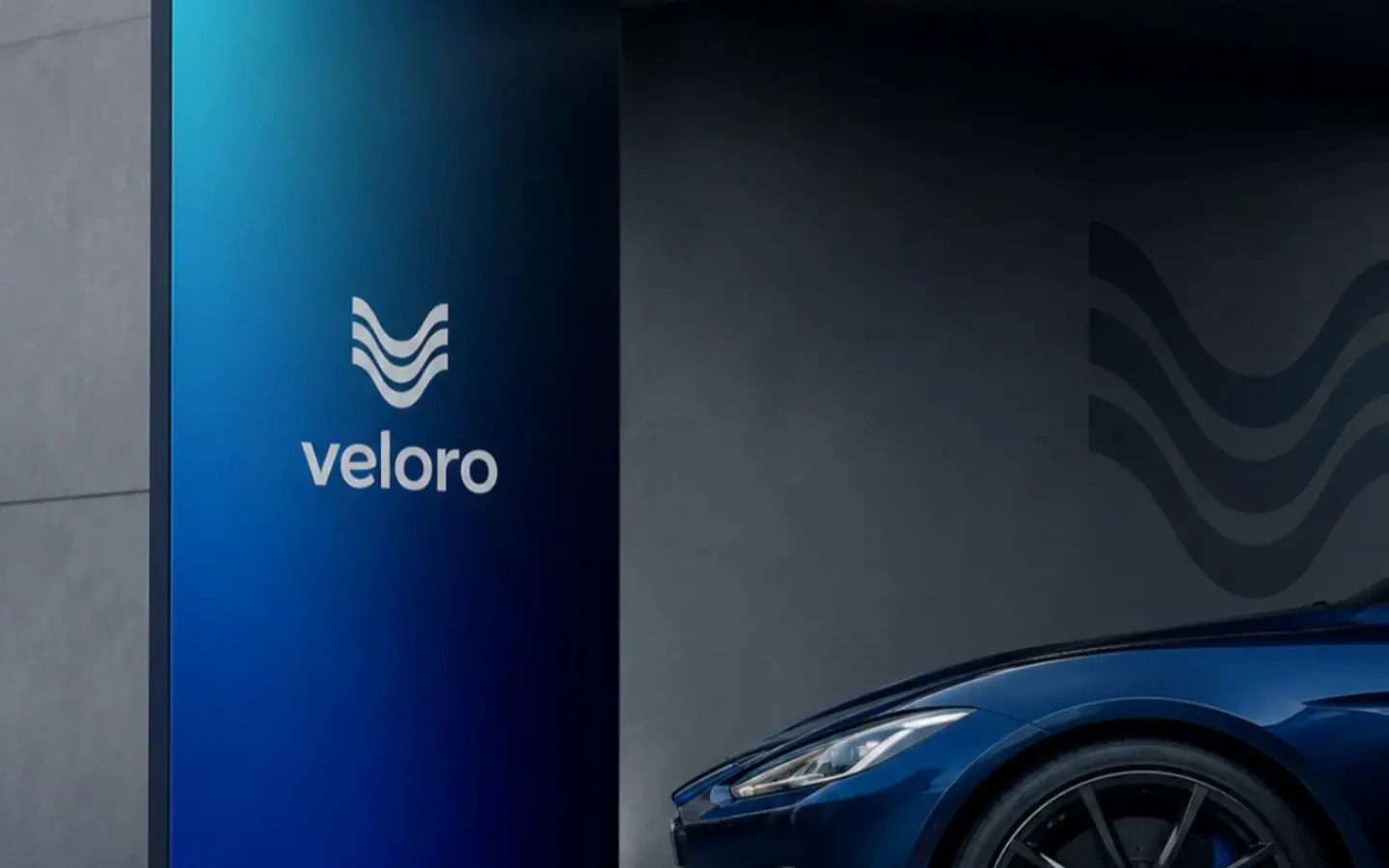
The Veloro pillar, blue against concrete, next to the nose of a blue car.

Veloro

Three waves drawn into a V: motion turned into a mark.

Veloro is a mobility brand. We drew the mark, the gradient from cyan through blue to black, and how they sit on everything a customer touches: the box, the card, the brochure, the showroom pillar, the office wall.

Year
2026
Sector
Mobility · Automotive
Disciplines
Logo, Brand identity
  • The Veloro mark and name, white on the cyan-to-black gradient.
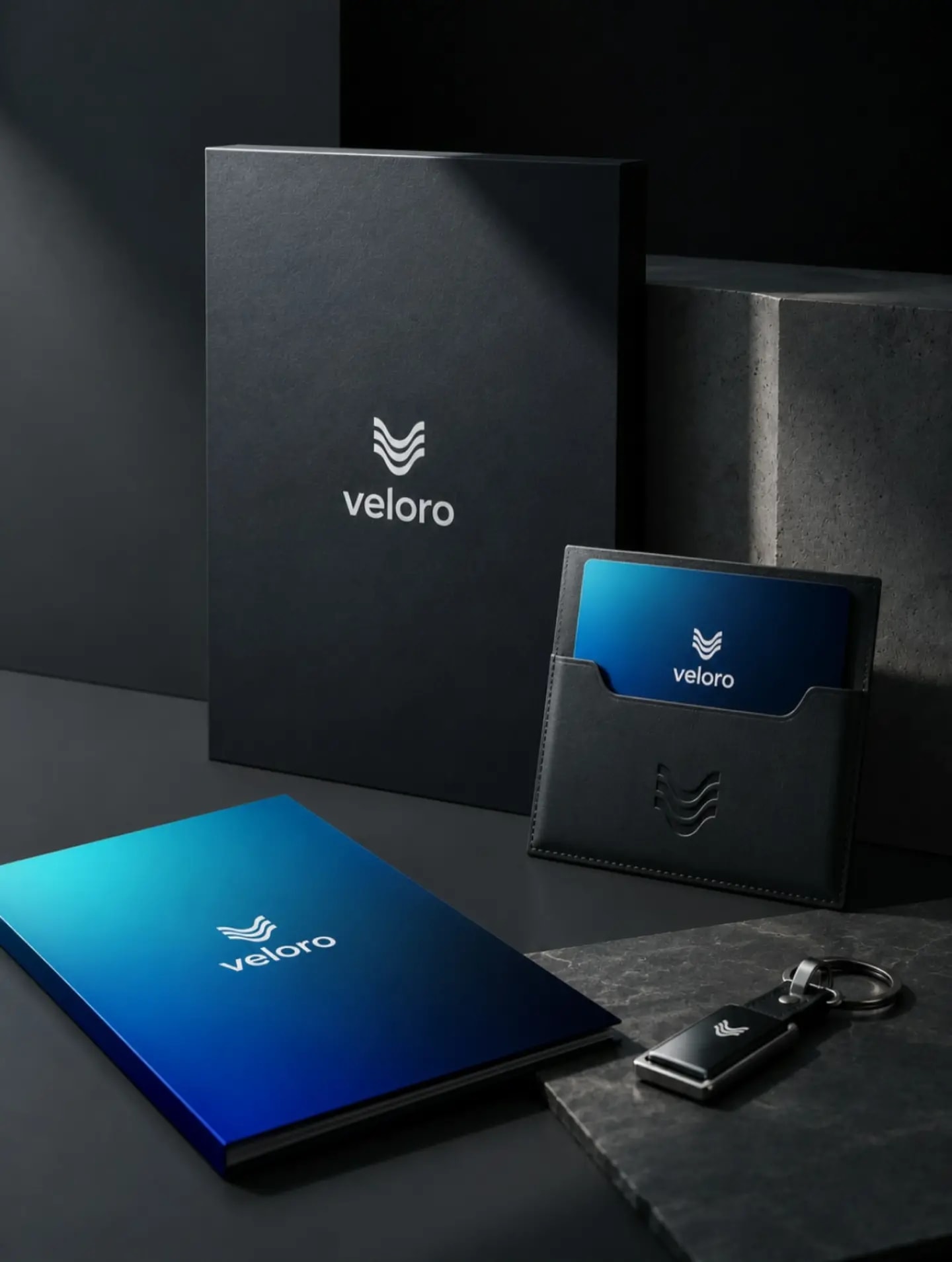
  • The black box, the blue card in its leather sleeve, the notebook and the Veloro key fob.
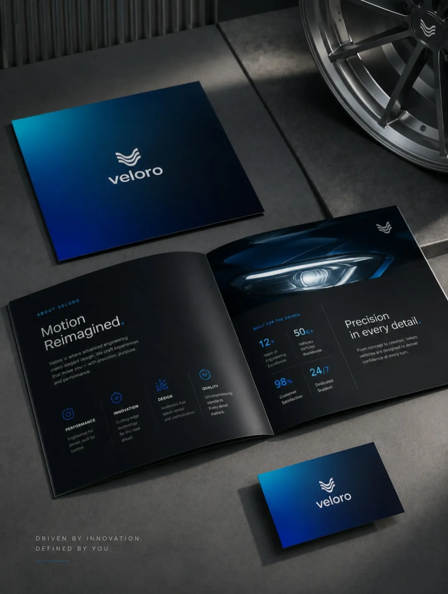
  • The “Motion Reimagined” brochure, its cover and the business card.
  • The Veloro pillar at the showroom entrance and the mark on the wall, next to a blue car.
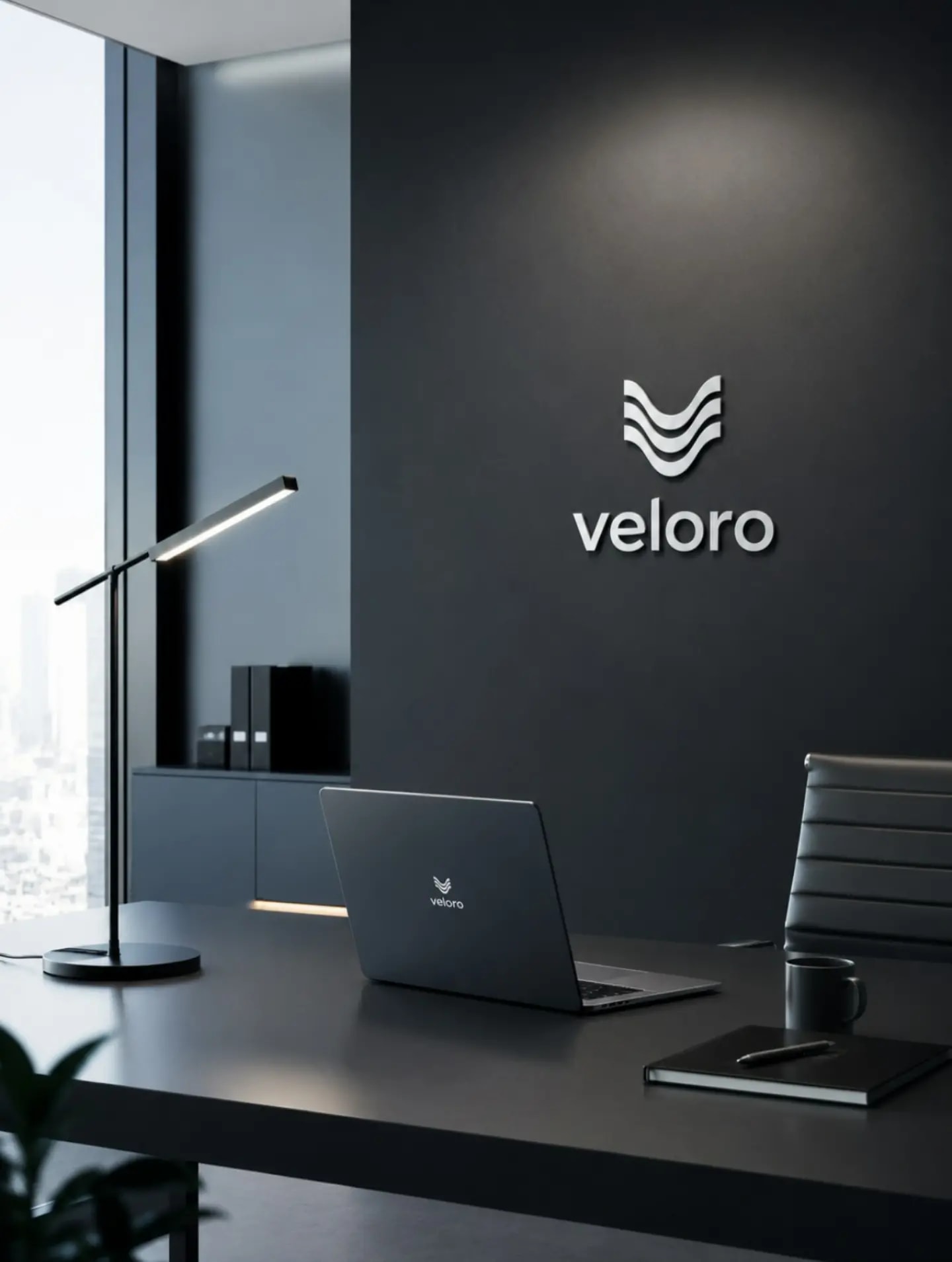
  • The mark raised on the office wall and on a laptop.
  • The construction grid of the mark: three bands from equal circles, on three vertical axes.